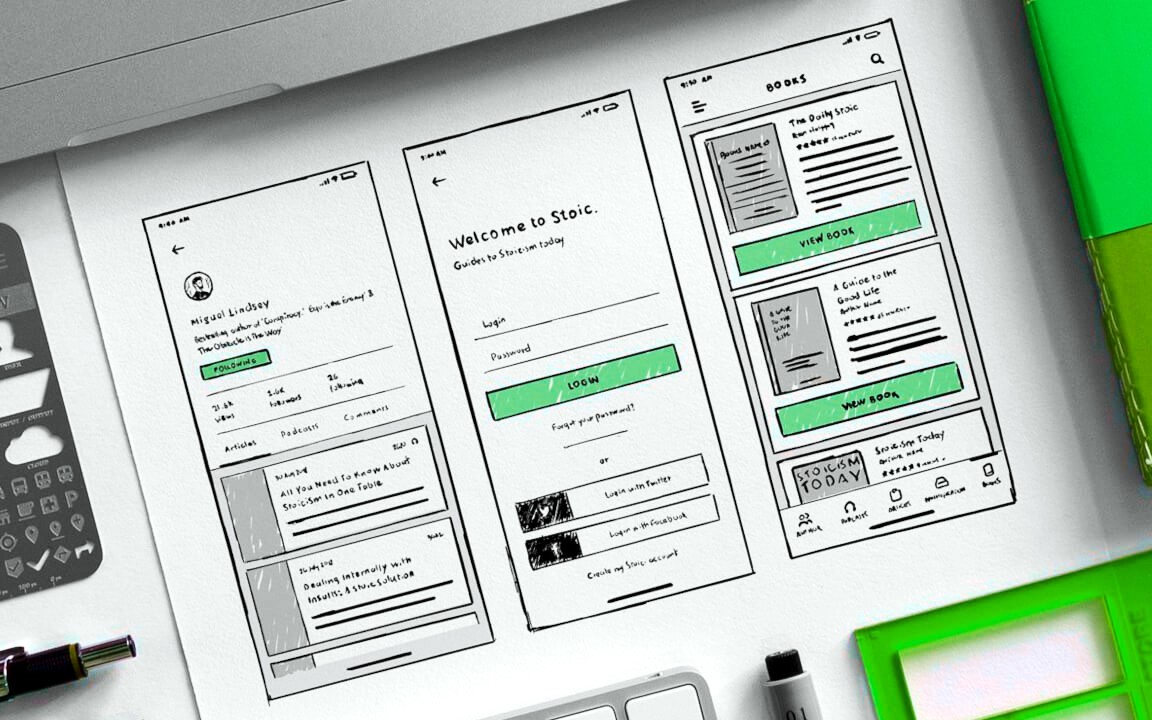
A digital product's first handshake with its audience, its most immediate ambassador, is its User Interface (UI). Long before users delve into complex functionalities or appreciate sophisticated backend engineering, they encounter the visual landscape – the buttons, a typography, the colours, the layout. This initial interaction is pivotal. A well-crafted UI has the power to draw users in, guide them intuitively, and create a sense of effortless engagement, transforming a simple interaction into a captivating digital experience. Conversely, a poorly designed interface can be a significant barrier, leading to frustration, abandonment, and ultimately, product failure. The art and science of UI design, therefore, are not mere embellishments but fundamental components of successful digital products.
At its core, User Interface design is the process of making interfaces in software or computerized devices easy to use and pleasurable. It focuses on the look and feel, the presentation and interactivity of a product. While often discussed in tandem with User Experience (UX) design – which encompasses the overall feel of the experience – UI is specifically concerned with the graphical elements and their orchestration to create a coherent and aesthetically pleasing environment. A beautiful UI that is difficult to navigate fails just as surely as a functional but visually unappealing one. The magic lies in the seamless fusion of form and function.
The journey to creating captivating digital experiences through UI design is paved with established principles and evolving trends. Understanding these is crucial for any designer aiming to make a meaningful impact.
Foundational Principles of Effective UI Design
Certain timeless principles underpin all successful user interfaces, acting as a compass for designers:
- Clarity: The interface should be unambiguous. Users should be able to understand what they are looking at, what to do next, and what will happen when they interact with an element. This involves clear labelling, intuitive iconography, and a logical visual hierarchy. Avoid jargon and ensure that interactive elements are clearly distinguishable from static content.
- Consistency: Elements throughout the interface should look and behave in a predictable manner. A button style, a color-coding system, or a navigational pattern, once introduced, should be maintained across the entire application. This consistency reduces the learning curve and helps users build a mental model of how the product works. Platform conventions (e.g., iOS Human Interface Guidelines, Android Material Design) should also be respected to ensure familiarity.
- Feedback: The interface must provide immediate and clear feedback for every user action. This can range from a button changing state upon being clicked, to a loading indicator for a time-consuming process, or an error message clearly explaining a problem. Feedback reassures users that the system has received their input and is processing it, preventing confusion and repetitive actions.
- Efficiency: A good UI allows users to achieve their goals quickly and with minimal effort. This involves thoughtful information architecture, streamlined workflows, and easily accessible common actions. Shortcuts, intelligent defaults, and progressive disclosure of information can significantly enhance efficiency.
- Familiarity: Leveraging familiar patterns and elements makes an interface easier to learn and use. Users come with preconceived notions based on their experiences with other digital products. Using standard icons (e.g., a magnifying glass for search, a cogwheel for settings) or common interaction patterns reduces cognitive load.
- Flexibility: The interface should be able to accommodate users with varying levels of skill and different preferences. This might involve offering customization options, keyboard shortcuts for power users, or different ways to accomplish the same task.
- Visual Hierarchy: A strong visual hierarchy guides the user's eye to the most important elements on the screen first. This is achieved through strategic use of size, color, contrast, spacing, and typography. Important actions or information should be more prominent than less critical items.
Key Elements of User Interface Design
Designers have a palette of visual elements to work with. The skillful combination of these elements is what brings an interface to life:
- Layout and Structure: This refers to the arrangement of elements on a page or screen. A well-structured layout is balanced, organized, and guides the user naturally through the content. Grid systems are often employed to ensure alignment and consistency.
- Color: Color is a powerful tool in UI design, capable of evoking emotion, conveying meaning, establishing brand identity, and drawing attention. A carefully chosen color palette enhances usability and aesthetic appeal. Considerations include contrast for readability, the psychological impact of different hues, and accessibility for color-blind users.
- Typography: The choice of fonts, their size, weight, and spacing significantly impacts readability and the overall tone of the interface. Good typography makes text legible and visually appealing, contributing to a more comfortable reading experience.
- Iconography: Icons are visual symbols used to represent objects, actions, or ideas. Effective icons are simple, universally understandable, and visually consistent with the overall design language. They can enhance navigation and make an interface more intuitive by transcending language barriers.
- Imagery and Graphics: Photographs, illustrations, and other visual elements can make an interface more engaging and help communicate complex information quickly. The choice of imagery should align with the brand and the target audience.
- Controls and Input Methods: These are the elements users interact with, such as buttons, sliders, text fields, dropdown menus, and toggles. They need to be clearly identifiable as interactive elements and provide appropriate feedback.
- Microinteractions: These are small, often subtle animations or visual responses that occur when a user interacts with an element (e.g., a button animating on hover, a satisfying sound on completing an action). Well-designed microinteractions can significantly enhance the user's sense of engagement and delight, making the interface feel more alive and responsive.
Emerging Trends and Future Directions in UI Design
The field of UI design is dynamic, constantly influenced by technological advancements and evolving user expectations. Several trends are shaping the future of digital experiences:
- Dark Mode Adoption: Increasingly popular for its aesthetic appeal, reduced eye strain in low-light conditions, and potential battery-saving benefits on OLED screens, dark mode is becoming a standard offering in many applications.
- Neumorphism and Glassmorphism: While skeuomorphism (designing elements to resemble their real-world counterparts) has faded, newer styles like neumorphism (soft, extruded plastic look) and glassmorphism (frosted glass effect) are being explored, offering a fresh visual take, though their practical usability and accessibility need careful consideration.
- Motion Design and Advanced Microinteractions: Richer animations and more sophisticated microinteractions are being used to provide better feedback, guide users, and create more delightful experiences. This includes animated transitions, interactive data visualizations, and dynamic brand elements.
- AI-Powered Personalization: Artificial intelligence is enabling interfaces that adapt to individual user needs and preferences in real-time. This can manifest as personalized content recommendations, dynamically adjusted layouts, or even AI-generated UI elements tailored to specific user behaviors.
- Voice User Interfaces (VUI): As voice assistants become more integrated into our lives, VUI design is gaining importance. Designing intuitive and efficient voice interactions presents unique challenges and opportunities, moving beyond purely graphical interfaces.
- Augmented Reality (AR) and Virtual Reality (VR) Interfaces: With the growth of AR and VR technologies, UI designers are exploring new paradigms for interaction in three-dimensional, immersive environments. This requires rethinking traditional 2D interface conventions.
- Inclusive Design and Accessibility (A11y): There's a growing and crucial emphasis on designing interfaces that are usable by everyone, regardless of their abilities. This involves adhering to Web Content Accessibility Guidelines (WCAG), considering users with visual, auditory, motor, and cognitive impairments, and testing with diverse user groups. This is not just a trend but a fundamental ethical and business imperative.
- Ethical Design: Designers are becoming more conscious of the ethical implications of their work, considering factors like user privacy, data security, a potential for manipulative patterns ("dark patterns"), and the overall impact of digital products on well-being.
- Cross-Platform Cohesion: Users expect a seamless experience as they move between devices. UI design needs to ensure brand consistency and functional parity while respecting the native conventions and interaction patterns of each platform (desktop, web, mobile, wearables).
- Minimalism with Purpose: While not new, minimalism continues to evolve, focusing on reducing clutter, prioritizing content, and using whitespace effectively to create clean, focused, and elegant interfaces. The emphasis is on "less, but better."
The Indispensable Role of User Research and Testing
Captivating UI design is not born in a vacuum. It is an iterative process deeply informed by user research and validated through rigorous testing.
- User Research: Understanding the target audience – their needs, goals, behaviors, and pain points – is the foundation of effective UI design. Techniques like user interviews, surveys, persona creation, and journey mapping provide invaluable insights that guide design decisions.
- Usability Testing: Once initial designs or prototypes are created, they must be tested with real users. Observing users as they interact with the interface helps identify usability problems, areas of confusion, and opportunities for improvement. Iterative testing and refinement are key to creating a polished and user-friendly product.
- A/B Testing: For specific UI elements or design variations, A/B testing can provide quantitative data on which version performs better in terms of user engagement, conversion rates, or task completion.
Tools of the Trade
Modern UI designers have a sophisticated array of tools at their disposal to bring their visions to life. Popular choices include:
- Figma: A collaborative, web-based interface design tool that has gained immense popularity for its real-time collaboration features, robust vector editing capabilities, and extensive plugin ecosystem.
- Sketch: A vector graphics editor popular among Mac users, known for its clean interface and strong focus on UI/UX design.
- Adobe XD: Part of the Adobe Creative Cloud suite, XD offers tools for designing, prototyping, and sharing user experiences.
- Prototyping Tools: Tools like InVision, Marvel, and Principle allow designers to create interactive prototypes that simulate the user flow and interactions, facilitating testing and stakeholder feedback.
The Symbiotic Relationship Between UI and UX
It's impossible to discuss UI design without acknowledging its intrinsic link to User Experience (UX) design. While UI focuses on the visual and interactive elements, UX is concerned with the overall journey and the user's feelings about it. A beautiful UI (good UI design) is a critical component of a positive UX, but it cannot compensate for poor usability, confusing information architecture, or a product that doesn't meet user needs (all aspects of UX). The most captivating digital experiences arise when UI and UX designers work in close collaboration, ensuring that the visual appeal enhances, rather than hinders, the overall usability and satisfaction of the product.
In conclusion, User Interface design is a multifaceted discipline that blends artistry with scientific rigor. It's about creating visual languages that speak clearly to users, guiding them effortlessly towards their goals while delighting them along the way. As technology continues to evolve, so too will the challenges and opportunities for UI designers. By staying grounded in core principles, embracing new trends thoughtfully, prioritizing user needs through research and testing, and fostering a deep understanding of human-computer interaction, designers can continue to craft captivating digital experiences that not only look good but also feel intuitive, efficient, and ultimately, human. The screen is their canvas, and their work shapes how we interact with the digital world, one pixel, one interaction at a time.